Guest post written by Anne Stefanyk, CEO, Kanopi Studios
Let’s imagine you’ve just discovered this amazing new nonprofit organization whose mission really resonates with you. You decide to search their name online and find their dedicated nonprofit website.
After some digging around, you finally find their online donation page link. But as soon as you click on it, you’re instead taken to another site to fill out a form. On top of that, the form is extremely long, requiring you to fill out a ton of information that you don’t feel comfortable giving out. Instead, you decide to click away and forget about it.
This is just one scenario in which the online donation experience was not a success.
As a fundraising professional, you already know that if you want to increase your completed gifts and lower your donation page bounce rate, you should be doing everything you can to optimize the online giving process.
However, whether you’re just building out your giving process now or want to improve upon it in the aftermath of the COVID-19 pandemic, it’s always a good idea to go over the basics and ensure your current donation page isn’t inadvertently turning supporters away. Here are our top tips:
-
Provide a seamless online giving experience
-
Incorporate calls-to-action throughout your site
-
Ensure your website is accessible
-
Use your website to tell your nonprofit’s story
From your website’s user experience to the way you layout your site content, there are many factors that can impact the online donation process. Let’s take a closer look.
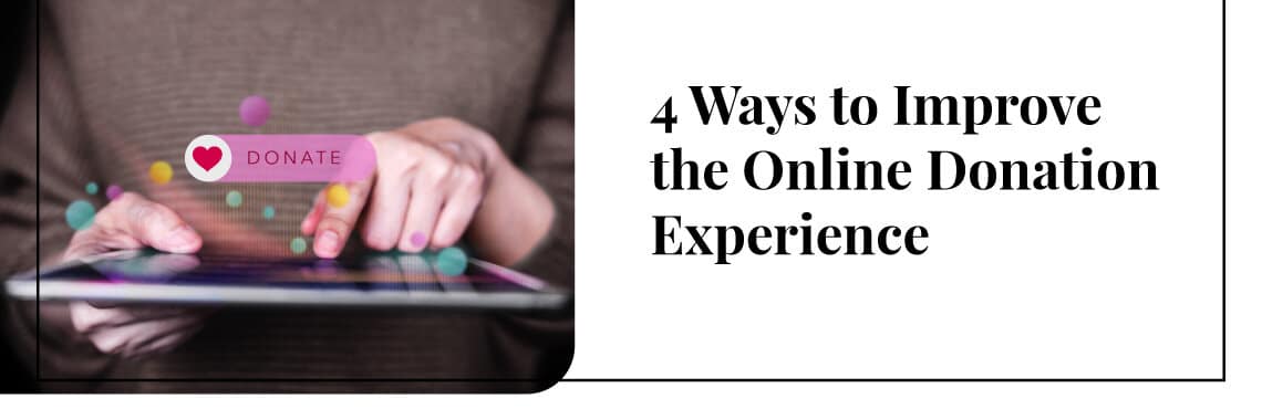
1. Provide a seamless online giving experience
If you’re looking to optimize how supporters give to your organization online, the first component you should tackle is your online donation page. This is the go-to place supporters will look if they decide they want to give to your organization and it can make or break whether that gift is even completed.
In fact, the experts from Donately say, “Your donation page can mean the difference between driving gifts and losing support during the final stage of the donation process.” This is because it’s extremely easy for supporters to lose focus, click on a notification, and otherwise leave the giving process just because the form took too long or includes unnecessary required questions.
You definitely don’t want your donation page to hold your organization back from reaching its fundraising goals, especially when small tweaks and adjustments here or there can make a huge impact.
Here are the changes that we recommend making to your own donation page in support of a seamless giving process:
-
Prevent donors from going to a third-party page by embedding the donation form within your website.
-
Ensure you can customize your donation forms to only ask for the essential information and get rid of unnecessary fields.
-
Offer suggested giving amounts with direct impact tied to them.
-
Minimize the number of optional form fields, and if you do have extra questions, limit them to one or two and make sure you clearly mark that they are not required.
-
Optimize the donation page for mobile use since 51% of people who visit a nonprofit’s website do so on a mobile device.
-
Use an integrated payment tool so that the giving process is as secure as possible, which is essential if you want to build trust with your supporters.
No matter what, your donation page should be doing all it can to encourage a gift, not hinder it with unnecessary questions or distracting content. The right tools and donation page design will make the giving process more convenient for your donors and will result in more completed gifts!
2. Incorporate calls-to-action throughout your site
Now that your online donation page is optimized for the giving process, you now have to make sure that your prospects know how to find it. To do so, we recommend incorporating calls-to-action (CTA) throughout your site in areas that inspire giving.
What does this mean? A CTA is an image, link, or button that prompts users to take action. In this case, the acting is donating. Your CTA might look like a button with the text “Donate today to help!” that sends users to the appropriate page with the right form.
You shouldn’t just put CTAs wherever you want and in as many places as possible. Remember, CTAs should go on pages that inspire giving. This way, you’re leveraging the exact moment that supporters are inspired by providing an immediate way to take action. Having the CTA on a random blog post is much less impactful than embedding one on a page that lists past accomplishments of your organization.
Here are some other pages where supporters are more inclined to give:
-
Mission statement page
-
A campaign or event page
-
Page recapping past fundraising accomplishments and goals met
Along with these, we also recommend putting a clear online donation CTA right within your homepage. After all, this is likely the first page supporters will land on during their donor journey. Make giving as easy as possible by providing a convenient way for your passionate audience to take action.
3. Ensure your website is accessible
Kanopi defines an accessible website with this description: “all the information and functionality on your website is accessible to any person, regardless of their individual needs and challenges.” This means that an accessible website is essential if you want your online content to reach as many prospects as possible, regardless of their location, device, language, or ability.
For instance, an inaccessible website might turn a supporter away just because they are color blind and have trouble reading the text on your site. Because your site is inaccessible, you lose that online engagement and otherwise impede the ability of certain supporters to give to your organization.
So, how can you ensure that your website is accessible? To do so, your site needs to be designed with all abilities in mind and maintain regulatory compliance. The laws that your website will need to comply with are the Americans With Disabilities Act (ADA) and the Web Content Accessibility Guidelines (WCAG). In fact, failing to comply with these laws can even result in legal action.
Here are some common ways that you can prioritize accessibility and compliance for your nonprofit site:
-
Make sure that non-text content (image, video, audio) has a text alternative.
-
Stay away from using sensory characteristics like sound and appearance as the only option to convey important information.
-
Don’t use flashy elements or bright lights to protect those who are seizure-prone.
-
Ensure your website is mobile optimized.
-
Determine if your website has any broken links or images.
While the above general tips are helpful, you might feel more confident with professional help and guidance. At this point, we’d recommend partnering with a dedicated nonprofit technology consultant for more personalized next steps!
4. Use your website to tell your nonprofit’s story
The last piece of advice for improving the online donation experience is to remind supporters why they’re giving in the first place. After all, not everyone will take time out of their day and money out of their wallets just to help an organization out. Donors do it because they are passionate about your cause and mission.
Your nonprofit’s story is critical in this case and plays a crucial role in donor engagement. If you want to remind donors of why they’re giving in the first place, determine how your website can help tell your nonprofit story.
Let’s go back to the basics. The best nonprofit websites are ones that meet their visitors’ needs. Most people will come to your website to learn more about your mission and take action to support it, whether it’s reading recent news, going through your upcoming events, or exploring your online donation page. That’s also how they become familiar with your nonprofit’s story.
To summarize, when you incorporate your nonprofit’s story into website content, site visitors are reminded of why they care about your mission and are more likely to give as a result.
Here are some ways you can use your website to tell your nonprofit’s story:
-
Use your homepage to highlight past accomplishments and goals met.
-
Connect suggested giving amounts to direct impacts, like saying a $20 gift will help feed a family of five.
-
Display community stories of how your organization has helped individuals.
-
Embed images and videos of the people you’ve helped directly or the projects you’ve completed in the past, this puts a face to those that your donors are supporting.
-
Proudly display your mission statement on high traffic pages.
However, you don’t have to limit the storytelling just to your website. Other online engagements like your social media posts or your email newsletters can do just as well. Provide updates on past campaigns through your newsletters and post photos of your nonprofit in action on your Instagram account. No matter what, don’t forget to include a clear CTA so that supporters can take action immediately if they’re inspired!
Wrapping Up
The online donation experience is crucial to the success of your nonprofit, especially if you want to thrive in this modern fundraising environment. Make sure that your website and other online content does everything it can to support this. If you’re having trouble, just remember to imagine yourself in your donors’ shoes and refer back to this article for tips. Good luck!

About Anne Stefanyk
As Founder and CEO of Kanopi Studios, Anne helps create clarity around project needs and turns client conversations into actionable outcomes. She enjoys helping clients identify their problems, and then empowering the Kanopi team to execute great solutions.
Anne is an advocate for open source and co-organizes the Bay Area Drupal Camp. When she’s not contributing to the community or running her thoughtful web agency, she enjoys yoga, meditation, treehouses, dharma, cycling, paddleboarding, kayaking, and hanging with her nephew.
https://twitter.com/Anne_Kanopi