In our increasingly digital landscape, nonprofits have moved away from door-to-door solicitations, telethons, and direct mail for fundraising. Now, they rely heavily on their online donation pages to generate funds to power their mission. When designed with donors in mind, online donation pages are easy to access, quick to fill out, and convenient to return to again and again.
The challenging part of getting great results with your donation page is learning how to design it. However, by learning effective donation page design strategies and leveraging the right technology to enhance your donation process, your organization will reap the rewards of more online donations.
In this guide, we’ll go over three tips to help you optimize your donation page’s design. Whether you want to refresh your page for a Giving Tuesday campaign or tune it up to boost everyday fundraising efforts, a strong donation page design can help you maximize giving. Let’s begin!
1. Leverage your nonprofit’s brand.
With a branded donation page, your website visitors will feel like their giving experience is fully tied to your organization. A lack of branding can leave the page looking bland or even unsafe to use, holding you back from connecting with your donors at that last crucial step where they submit a donation.
Here are three visual branding elements we recommend incorporating into your page:
-
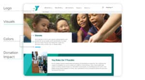
- Logo: Ensure that your supporters know that your donation page belongs to your nonprofit by placing your logo in a prominent place, such as the page header. That way, donors will feel confident that their funds are going to the right organization.
- Colors: Use your nonprofit’s colors to remind visitors on your donation page what your work is all about. For example, an organization focused on providing group therapy to breast cancer survivors might use the color pink, which is synonymous with breast cancer awareness. Or, a nonprofit focused on environmental conservation might use the color green in their color scheme to evoke thoughts of nature.
- Visuals: When you use pictures, graphics, and videos, you’re communicating information in a way that resonates with people emotionally. Our top recommendation for adding visuals to your donation page is to use visuals of your beneficiaries. This helps donors feel like their donation is truly going toward real people’s needs.
- Donation impact: Reinforce your mission by letting donors know how their funds will help your organization’s beneficiaries. For example, UNICEF’s donation page says: “All children deserve to live safe and healthy lives. Your 100% tax-deductible donation to UNICEF USA helps ensure the world’s most vulnerable children get the nutrition, water, protection, education and health care they need to survive and thrive. You can make a difference today.”
Here’s an example of the YMCA’s donation page, annotated to show you how they incorporate these visual branding elements:
The key to solid donation page branding is ensuring it is consistent with the rest of your nonprofit’s website. This will make your nonprofit appear more professional and organized, signaling to your supporters that you’re a trustworthy organization.
To make consistent branding easier for your organization, use a nonprofit website template to build your donation page. That way, you won’t have to worry about coding or creating a well-designed layout from scratch and can focus on generating great content to spotlight your organization’s identity.
2. Keep it simple.
Although your donation page is important to your nonprofit, recognize that your supporters don’t want to spend a great deal of time on it. Ideally, they want to fill out your form and make their donation as fast as possible. You can support this preference by creating a well-designed, minimalistic donation page—remember, less is more.
Here’s how to design a donation page that helps your supporters get the job done:
- Use ample white space. White space, or negative space, is the space between elements on a web page. White space keeps a page from looking too busy, helping website visitors easily navigate through the donation process. Since your donation page will include a form with some fields, make sure they’re reasonably spaced apart to ensure donors aren’t visually overwhelmed.
- Only ask necessary questions. Donors want the giving experience to be fast, easy, and convenient, meaning they don’t want to spend their time answering dozens of questions. On your donation page, ask only for necessary information like contact information and payment details. If you do want to ask for additional information, such as how the donor heard about your nonprofit, make it optional or send a follow-up questionnaire in your thank-you message.
- Condense your donation appeal. Make your on-page donation appeal short and sweet, but ensure it establishes a connection between your donors’ gifts and the tangible change that will be made in the community. An animal welfare organization might, for example, write something like, “By giving, you can provide thousands of animals with a second chance at life!” at the top of the page.
With a CMS built for nonprofits, designing a minimalistic and visually appealing donation page can be a breeze. Check out Morweb’s list of the best nonprofit website builders to see your options!
3. Offer multiple ways to give.
All of the best nonprofit websites offer various ways to give. After all, donors love to have options. By providing multiple ways to contribute to your cause, you empower them to expand their capacity for giving and make more of a difference for your nonprofit.
The options you should offer will depend on your cause and your audience. For example, if you mainly interact with your supporters through hybrid events, you might engage them further by offering mobile giving as an option. Or, if multiple donors have expressed a desire to give more, you might include suggested giving amounts on your donation page that encourage them to increase their gifts.
Here are some additional options you can offer your donors:
-
- Matching gifts: Some employers offer gift matching, which means they will match charitable donations their employees make with a donation of their own, helping your donors to increase their impact! Partner with a matching gift provider that offers a matching gift database that can be integrated into your donation form. Check out 360MatchPro’s list of the top matching gift companies to explore your options!
- Monthly giving program: Many donors would donate regularly if they didn’t have to manually submit the donation form each time. To make recurring giving a breeze, offer a monthly giving program where donors are billed once a month. The best way to set this up is to include an option to opt-in to your program on your donation form. It’s a win-win—donors automatically make monthly contributions and you gain sustainable funding for your nonprofit’s budget.
- Sponsorships: Some nonprofits, like Rising Star Outreach, offer the option for donors to sponsor a specific beneficiary. In the case of Rising Star Outreach, donors can sponsor a student from a leprosy colony for a monthly donation of $30. Try doing the same thing with your organization by offering donors the opportunity to sponsor a person, place, or animal that benefits from your work!
On top of these options, support donor giving preferences by accepting various payment methods. This includes credit card, debit card, e-check, and ACH. By providing payment flexibility in tandem with offering multiple ways to give, you can develop a giving experience that caters to all supporters.
Transforming and optimizing your donation page is only the first step to creating a satisfying donation process for your supporters. After they make a gift, it’s important to keep donors engaged through proper stewardship. As you improve the online donation experience for your supporters, keep in mind how you’ll strengthen these relationships, whether that’s through email newsletters, event invitations, or volunteer opportunities.
 About the Author
Murad Bushnaq is the Founder and CEO of Morweb. Since its inception in 2014, Murad has acted as Creative Director and Chief Technologist to help nonprofits spread their vision online through engaging design, intuitive software and strategic communication.